Showing posts with label Colours. Show all posts

September 12, 2015

Edmonton Decorator | Choosing the Right Colours

The Fool Proof Guide to Choosing Colours for Your Home


If you're a photographer, a makeup artist, a decorator, or graphic designer you've had the opportunity to learn about colour theory. You get into details of complementary colours, tints and shades, and additive versus subtractive colour. But why get bogged down in technical details when the real questions is: How do I know if these colours go well together?

 Let me ask you a simple question: which picture is easier to understand? Picture "A" or picture "B".  With a simple glance, it's easy to understand that picture B is a photo of an eggplant. Pretty simple, right?
The greatest artist in the world created that eggplant: Mother Nature and she is never wrong. So if you want a FOOLPROOF way to picking colours for your home, just look to Mother Nature for your inspiration. She's never wrong.


I've compiled some colour palettes from Design Seeds as they rely heavily on nature for their inspiration. Enjoy!


If you need help choosing colours for your home, contact me to schedule a Colour Consultation. They start at just $150. Learn more about them by visiting my Services page.


January 5, 2015

Edmonton Decorator | Benjamin Moore Colour of the Year

Benjamin Moore is one of my favourite paint manufacturers. And in addition to Pantone, I look to them for the upcoming colour trends.

I've been saying for a while that green will become the new "IT" colour in interior design and decorating. So, I was pleased to see Benjamin Moore name Guilford Green as their colour of the year for 2015.

But, is this Benjamin Moore paint colour a "bore" or a "score"?


I will admit that I have not seen this colour in real life. But my verdict is, that this colour is a BORE. I love green for its calming effects, but I find this shade to be far too reminiscent of out dated hospital rooms and elder care facilities.

Benjamin Moore also published a list of of their "green family" for 2015. Thankfully, this list had some redeeming colours. I love the vibrancy of Split Pea! It would be great in a kitchen or living room. Antique Jade and Sea Horse both get honourable mention. The other colours are utterly forgettable.


So, what do you think of Benjamin Moore's Guilford Green? Do you rate it a "bore" or a "score"?

Don't forget to check out the rest of the design collection for 2015.


February 8, 2014

Edmonton Decorator | Blue Nile Painting | Hello, Spring

Transitioning Into Spring

Recently, I had the honour to be interviewed by the lovely Pamella at Blue Nile Painting Ltd. on how to "de-winterize" your home decor. Here's our Q and A!

Blue Nile Painting Edmonton

"Yet again, we at Blue Nile got to meet another extraordinary Edmonton designer. Rachel Schofield is known as the Queen of the 90 minute home makeover and (unofficial) Patron Saint of incredible style. She is an Edmonton interior decorator and home stager. We had Rachel over to our place to help with our bathroom renos and overall design tips. It was worth every minute!

A few weeks ago when warm weather graced us in Edmonton, we began to feel a bit of Spring Fever. Our space felt heavy and dark and we were craving some sunshine and lightness. Was it too soon to begin to de-winterize our place? When is it the right time to transition into the next season and what are the easiest and most effective ways to make an impact in your space?

We picked up the phone and called Rachel. After a very fun and informative chat, we HAD to share what we learned. So here it is, ways to make the leap into the new season.


BNP: Now that the holiday season is over and we are eagerly awaiting Spring, what are some ways we can we begin to prepare our interior space for the changing seasons?

RS: Removing old layers (blankets and pillows) and introducing a new colour is a great way to ease into Spring. You can work with what you already have in your space. Lighten up! Choose lighter colours and lighter fabrics. Change your bedding to white or a floral print. Opt for less bulk as well and change out your pillows.

BNP: Are you still seeing “Winter” trends in January and February? Should we wait before we transition into more of a Spring decor?

RS: We are full on into Spring trends. Although we may still be experiencing sub-zero weather, the key is to follow fashion trends, so Spring is on it’s way.

BNP: What are the Spring trends you are seeing?

RS: The colour we are seeing is Radiant Orchid. It goes well with greens, yellows, and greys. (Visit Rachel’s post about this vibrant colour). I recommend using this colour as an accent colour like a wallpaper, pillow, fabric, maybe a feature wall. With textures and patterns we have made a shift from stripes into more floral, lace, fringe, and macrame. Wallpaper is also very popular, just do one wall. When thinking furniture think lightness, airiness, glass furniture, mirrored, reflective, and glass doors.

BNP: What are your favourite places to shop and online spaces to visit for inspiration?

RS: I love Jonathan Adler. It’s a great site to gather inspiration and ideas. A place I enjoy to browse and shop is Z Gallerie. I also adore the Celebrity designer collections at Target online.

BNP: What are your design/decor inspirations for 2014?

RS: Do-it -yourself projects! I am committed to trying out some projects this year. I have started a Pinterest Board.

BNP: And finally, we like to share goals. Our goal for this year is expansion. Expansion in our dreams, service, and how we do business. Hopefully a new company van and maybe an office later in the year. What is your goal for 2014?

RS: To introduce decluttering and organzation services. I think it’s a stumbling block to many people creating their perfect home. Once they reduce the clutter it’s a lot easier to see what can and needs to be done. It’s a necessary pre-cursor to a successful design project.

Ready for Spring? We are! Give Rachel a shout and put a spring into your step and your home decor!"

http://bluenilepainting.ca/
Meet Sam, Pamella and Paul of Blue Nile Painting.

Please be sure to give Blue Nile Painting a call! Together, their team will ensure your home, business, or large project gets the time and quality that it deserves so you can feel proud and confident of your beautiful painted space.


October 31, 2013

Edmonton Interior Decorator | 10 Rooms with Painted Ceilings | Design Trend


A lot of people and clients I know are afraid to put anything other than white or beige on their walls. I say, "No problem! Paint the ceiling instead." Granted, after I say that, they are more likely to pick a wall colour. Apparently, the thought of painting the ceiling is even more terrifying than painting the walls. But, perhaps after seeing this post on pretty, painted ceilings, they'll change their minds.

As you'll see, it works for bedrooms, bathrooms and kitchens. From contemporary, classic to dramatic. Have you changed yours? :)

Purple Painted Ceiling

Gray Painted Ceiling

Green Painted Ceiling

Green Painted Ceiling


Pink Painted Ceiling

Yellow Painted Ceiling

Pink Painted Ceiling


Stencil Painted Ceiling


Gold Painted Ceiling

Silver Painted Ceiling
If you liked this post, you'll love "Celebrating Ceilings."


October 27, 2012

Edmonton Interior Decorator | Colour Trend | Black in the Day

Most of my clients are pretty confident when it comes to making furniture selections. However, their biggest source of anxiety tends to focus on colour selection. If I suggest anything that is a whisper darker than white, many of them start to worry.

"Will the room look too small? Will I feel like the walls are closing in? Will it be depressing?"

The answer is: no, no and no. Not if it's done right and well balanced with other elements in the room.

To prove my point, I am showcasing rooms with the darkest paint possible: BLACK! I dare say, you will find these rooms chic and elegant -- never dull or depressing.


So, are you still afraid of the dark?


February 2, 2012

Edmonton Interior Decorator | Colourful Cuba

I've never been further south than California, so my recent two-week trip to Cuba was a real treat. Naturally, as a decorator, I was eager to soak up all of the unique architecture and brilliant colours.

I have to say, the Cubans whole-heartedly embrace a vibrant colour palette, and did I ever fall in love with it. I must confess, coming home to my high-contrast interior of black and white, made me long for the hues of my vacation retreat.

Below are a few rooms that remind me of the sunny colours of Cuba.


December 11, 2011

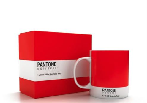
Edmonton Interior Decorator | Colour Trend | Pantone Tangerine

Pantone has unveiled a vibrant reddish-orange as the "it" colour for 2012. This vivid colour is aptly named, Tangerine Tango. I adore this hue, and it reminds me of sunsets and Bellinis. Would you tango with this wild tangerine?

Photobucket